

Two generated receipts can carry the exact same words and totals, and one will read as completely real while the other looks like a graphic. The difference is not the content, it is the realism layer: the texture of the paper, the way the barcode is formed, the subtle unevenness of the ink. These are the details that turn a flat digital file into something that reads as a physical object. If you want a fake receipt that holds up to a close look, this is the layer worth understanding.
Why a flat receipt looks fake
The human eye has seen thousands of real receipts and knows, without conscious thought, what they look like as objects. Real thermal receipts are not crisp black on bright white. They have a faint grey sheen, a slight curl, ink that varies in darkness across the page, and usually a crease or two from being handled. A generated receipt that is perfectly flat, perfectly white and perfectly uniform violates all of that, and even a viewer who could not explain why will feel that something is off. Realism is largely about reintroducing the imperfections a real printer and a real pocket would add.
Paper texture
The base layer is the paper itself. Real receipts are usually thermal stock, which has a particular slightly glossy, slightly grey character, quite different from copy paper. A good tool lets you choose the texture, so the background reads as the right material rather than a white rectangle. For receipts that will be printed as props or shown at high resolution, this is the first thing that sells the object, because the surface is the largest visual element on the page.
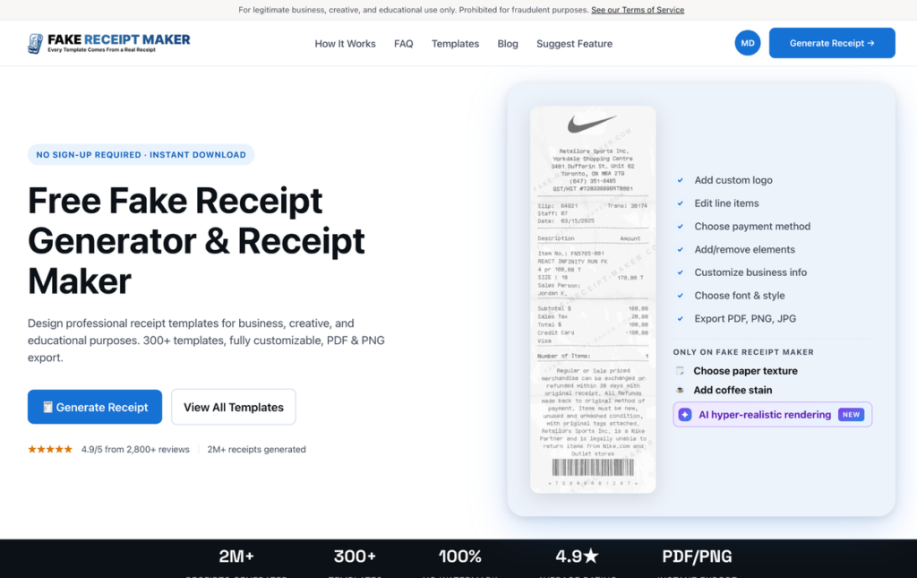
Online Receipt Maker treats this as a core feature, with selectable paper textures and the option to add wear like a coffee stain or a fold crease, which is exactly what pushes a digital file toward a believable physical receipt.
Barcodes that are actually formed correctly
The barcode is where amateurs are exposed. Real receipts carry barcodes and QR codes built to a chain’s internal numbering, with a specific digit structure and a checksum that makes them scannable in principle. A hand drawn fake usually has a random block of stripes that encodes nothing, and up close it is an obvious tell. A realistic generator produces a properly formed barcode automatically, which is one of those details that is tedious to fake by hand and trivial when the tool handles it. Getting the barcode right is a disproportionately large part of looking real.
Ink variation
The most subtle layer is the ink. Real thermal printers do not lay down uniform black. The darkness varies slightly across the page, some characters are a touch fainter, and there can be light banding where the print head moved. A receipt with perfectly uniform text reads as digital because no real printer produces that. The best tools simulate this with a rendering pass that adds the faint unevenness real printers create, and it is often the detail that tips a receipt from convincing to indistinguishable.
Tools like Fake Receipt Maker build on the same real layout foundation, so the structural realism is there before you even add the physical touches on top.
Common realism mistakes to avoid
A few recurring errors undo otherwise good work. The first is uniform crisp text, the dead giveaway that no real printer produces, so let the ink vary. The second is the wrong paper, a bright white copy paper background where a thermal receipt should have its grey sheen. The third is a decorative barcode that is clearly just stripes, which collapses under any close look. The fourth is over aging, where so much stain and crease is piled on that it reads as deliberately distressed rather than naturally used. And the fifth is mismatched realism, a pristine flat receipt with one cartoonish coffee stain slapped on, which looks staged. The aim is subtle, consistent imperfection that matches how a real receipt actually wears, not a pile of effects.
How much realism do you actually need?
The right amount depends on the use. A small on screen thumbnail in a mockup needs far less than a prop the camera will hold close, or a printed receipt someone will physically inspect. The rule of thumb is to match the realism to the scrutiny. For anything that will be examined closely, photographed or printed, use the full set of texture, barcode and ink details. For a quick background element, the accurate base template alone is often enough. Over polishing a small on screen receipt wastes effort, while under polishing a hero prop gets it noticed.
A note on legitimate use
Understanding realism is useful for props, mockups, training and design, where looking real serves an honest purpose. Both sites state their legitimate use only positioning openly on their own pages and prohibit using a realistic receipt to deceive anyone in a real transaction. The realism layer is a craft tool for believable creative and professional work, nothing more.
Bottom line
The gap between a fake receipt that looks real and one that looks like a graphic is the realism layer: paper texture for the right material, a correctly formed barcode instead of decorative stripes, and ink variation that mimics a real printer. Match the level of detail to how closely the receipt will be examined, lean on a tool that handles the barcode and ink for you, and a flat file becomes something that reads as a genuine physical receipt. Get these three layers right and you rarely need to think about realism again, because the result already behaves like a real object in front of a camera, on a printed page, or under the gaze of someone who handles receipts every day.